Our MANIFEST 40 is a celebration of collective excellence in stock selection, strategy and disciplined patience.
The 40 stocks are something of a barometer because we know that these community favorites are not simply followed … most of them are also widely owned, with considerable diligence and vigilance.
MANIFEST 40 (March 2016). Performance Results. These are the most widely followed stocks by Manifest Investing subscribers. Current leader Apple (AAPL) was added on 9/24/2009 and steadily climbed the ranks while generating a relative return of +20.3% (annualized) since then. Figures in parentheses are the ranking back in December 2015.
The rate of return is 9.0% since inception (9/30/2005). Bottom line? On an annualized basis, your community favorites have beaten the Wilshire 5000 by +3.6 percentage points — a relative, or excess, return that probably portends outsized success with our actual portfolios.
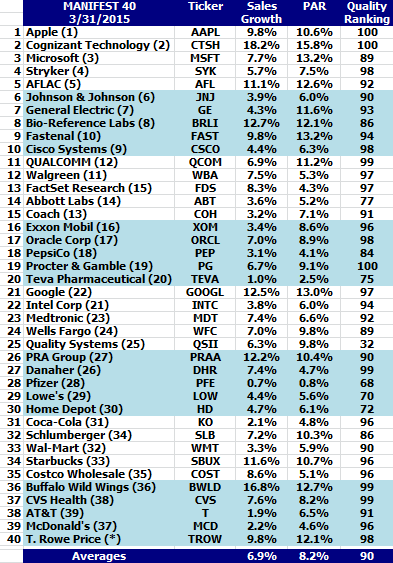
Quality (90) is solid and the overall return forecast (8.9%) is positioned to outperform the Wilshire 5000. At an average sales growth forecast of 6.8%, we’d to see some faster-growing companies adopted by our community.
Capturing Attention: Chargers
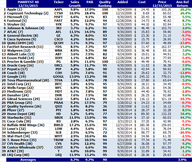
Gilead Sciences (GILD) moved from #25 to #22 as most of the list remained rather steady. Visa (V) is a new addition at #40. The results of $100 positions investing in any of the Top 40 companies can be viewed at any time via the public dashboard on the home page.
“We have always believed that the collective decisions made by our community of long-term investors are worth huddling over … a place where ideas are born.”
We launched the MANIFEST 40 in October 2005, built from the stocks that most frequently appear on subscriber dashboards, and this active and continuously maintained tracking dashboard has delivered a rate of return of 9.2% since inception.
The 40 stocks are something of a barometer because we know that these community favorites are not simply followed … most of them are also widely owned, with considerable diligence and vigilance. Bottom line? On an annualized basis, your community favorites have beaten the Wilshire 5000 by +3.4 percentage points — a relative return that nurtures smiles and bolsters the returns of our actual portfolios.
The average sales growth forecast of the portfolio (6.7%) suggests that it is dominated by the “Up, Straight and Parallel” core contributors. Quality (90) is solid and the overall return forecast (9.7%) is positioned to outperform the Wilshire 5000. We’d like to see the community discover and follow some smaller, faster-growing companies.
Performance Results
The absolute rate of return for the trailing 10 years is 9.2%.
Capturing Attention: Chargers
Gilead Sciences (GILD) moved from #29 to #25 as most of the list remained rather steady. Fastenal (FAST) shuffled up to #4 and Johnson & Johnson (JNJ) dropped a couple of positions. The results of $100 positions investing in any of the Top 40 companies can be viewed at any time at:
Our MANIFEST 40 is a celebration of collective excellence in stock selection, strategy and disciplined patience.
“We have always believed that the collective decisions made by our community of long-term investors are worth huddling over … a place where ideas are born.”
Our MANIFEST 40 is a celebration of collective excellence in stock selection, strategy and disciplined patience. We continuously monitor the 40 most-widely followed stocks by our community of subscribers at Manifest Investing.
“We have always believed that the collective decisions made by our community of like-minded, long-term investors are worth huddling over … a place where ideas are born.”
This managed “tracking portfolio” of your collective favorites has outperformed the Wilshire 5000 by +3.3%. The absolute rate of return for the trailing 9.5 years is 9.6%.
Capturing Attention: Chargers
QUALCOMM (QCOM) continues to ascend, moving from #12 to #11. CVS Health (CVS) has been bolstered of late and moves from #38 to #37.
T. Rowe Price (TROW) is a newcomer to the MANIFEST 40. The company was featured in Solomon Select in the July 2014 issue and has been discussed during a number of Round Tables and during other events. The asset manager is highly regarded in this long-term investing community and has been a favorite for decades.
Strongest Performers
The three top performers in the MANIFEST 40 since inception, based on annualized relative rate of return, are Cognizant Technology (+30.7%!), Apple (27.5%), PRA Group (20.2%).
The charter members of the MANIFEST 40: Microsoft (3), Stryker (4), AFLAC (5), Johnson & Johnson (6), General Electric (7), Cisco Systems (10), Walgreen (12), FactSet Research (13), Oracle Corp (17), PepsiCo (18), Teva Pharmaceutical (20), Intel Corp (22), Medtronic (23), Danaher (27) and Wal-Mart (33).
We’ll continue to pay the most attention to these community favorites. Keep up the good hunting!
More Fun With The MANIFEST 40
Here’s the listing (ranked from Most Widely Held, Descending) with a display of Opinions on Parade courtesy of Manifest Investing (consensus-based), Value Line, Morningstar, Standard & Poor’s, Analyst Consensus Estimates and Goldman Sachs.
Momentum is powerful and addictive. It can be hard to perform a selling analysis on a company that has been so good to you and your portfolio that you’re considering naming your next child or grandchild after the company. We’ve often wondered if we could build a monitoring method that could use relative strength indices and overbought breakdowns as another component of our portfolio-centered approach that is based on return forecasts and quality rankings.
We continue our exploration and vigilance using these long-term charts, starting with the company with the highest RSI at this time, Pfizer (PFE). The case studies will also include McDonald’s (MCD), Stryker (SYK) and Apple (AAPL).
We’ll close with an answer to the question: “It’s down 36% from its highs, would you buy Apple right now?”
Pfizer (PFE) has delivered a fairly massive advance — during a period when it went “non-core” with low and uncertain growth expectations over the last several years. The stock price has basically tripled in four years.
We’re reminded that a company can maintain an overbought condition (RSI>70) for months and even years … but we’ll be monitoring PFE going forward for the day when an excursion takes it to a value less than 70.
Just for kicks, a side-by-side comparison of the chronicle for Pfizer (PFE) displaying the elevated return forecasts at the price bottom, the convergence point (mid-2010) shown in the preceding image … and a steadily improving quality ranking.
Roll Call
So … are any of the stocks in neighborhood of 70 displaying “breaks” below 70 — making them sell consideration candidates?
We’ll start with the companies with return forecasts (PAR) less than the market median (MIPAR) at this time. We see that five companies cry out for a closer look. And since these would be more “challengeable” in portfolios (more likely to reside among the lower PARs in portfolios), it’s probably prudent and timely to do this on a continuing basis going forward.
The long-term RSI for 3M Company (MMM) is still increasing. We’ll be watching.
McDonald’s (MCD) is interesting. I hope none of you mind while I “think out loud” while trying to learn and decide with respect to the long-term potential value of monitoring from this perspective.
Observations:
1. I’ve shown three of the RSI breaks since 2008, denoted with the red arrows.
2. The concept is that we’re not surprised to see either a stock price decline or a disruption accompanied by an “extended trading range” following one of these turbulent disruptions.
3. The magnitude of the stock price correction and/or duration of the trading range seems to be somewhat proportional to the amount of geometric area (shaded green) preceding the price break. Note the subdued disruption in late 2010/early 2011.
4. We also know that we can be less concerned with high-quality core stocks and that RSI dips are less destructive so long as the long-term (60-month) trend, denoted in blue here is strong and increasing from left-to-right. (This is very consistent with our core holding and quality emphasis “theology.”)
5. I need to do more research regarding the RSI=50 level/threshold. Are the “reflections” or bounces at RSI=50 typical? Is there a chance that these reflections are signals (see mid-2009 and 4Q2012 & subsequent price advance) that the extended trading range could be waning or ending?
I hope the Danaher (DHR) 10-year chart will help illustrate why we’re scratching our heads over this. The magnitude and duration of the price corrections following the RSI breaks on this chart seem to be quite “proportional” to the overbought areas.
Community favorite Fastenal (FAST). It’d probably be fascinating to take a look at community sentiment (particularly the hand-wringing variety) during the relatively few disruptions over the last ten years. Note that FAST navigated/mitigated the bear market period exceptionally well during 2008-2009.
More research nudged on the RSI=50 breach moment shown here …
Leave it to community favorite Stryker (SYK) to be among the most colorful of this stroll.
1. The RSI, although near 70, is still an increasing trend.
2. Stryker (SYK) spent an extended period at the top of the MANIFEST 40, fueled by accumulation trends following that price correction in the middle of this display.
Shine Off The Apple?
And we’ll wrap up for now with the $64,000 question and one that many of you are waiting for: What does Apple (AAPL) look like?
Observations:
1. Apple is the most widely-followed stock in the MANIFEST 40.
2. The strength of that long-term (5-year trailing average) is massive.
3. That leads to a situation where AAPL was “potentially overbought” for a significantly extended period. See the RSI area from early 2010 to late 2012 — a period of over two years. This serves as a powerful reminder that under the right conditions, a stock can be overbought for a long time.
4. The area of the disruptions (stock price decline in combination with the duration of the trading range) does seem to correlate with the RSI areas and sharpness (rate of decline) of the overbought RSI condition.
During the most recent Round Table I was asked if I would sell (or buy) Apple as a long-term investor.
My short answer was that I didn’t think it was time to buy (yet).
We also want to point out that we strongly urged a trailing-stop mentality (if not programmed stops) for Apple in a series of articles a little over a year ago. Those of you who heeded that suggestion, you’re welcome.
This series of charts provides my longer answer to the question posed by the webcast attendee.
Take a look at the current area of disruption on display here for AAPL. Compare the preceding overbought RSI area, rate of RSI decline, etc. for the previous corrections. The extended period where RSI>70 leads to a pretty good size green-shaded area with an amplitude similar to previous episodes.
I think the yellow-shaded area is going to get materially larger for AAPL as this chart rolls forward. The only way for that to happen is for either (1) a continued price drop or (2) an extended trading range … or (gulp) a combination of both.
We’ll certainly be watching for a gain back above RSI=50 that is sustained. But I think it’s far more likely that the stock price for AAPL could continue to decline to the point where RSI is less than 30. I’d be vigilant for price surges to the upside to reduce my position over time — all the while waiting for the reversals that will put an end to the disruption area shown here.
We’ll continue with more long-term RSI snapshots in the Manifest Investing forum and will certainly flag any that deserve to be “flagged” and hope that any ensuing hypnosis will lead to focused vigilance … and an incremental benefit to our long-term returns.
As Eddy Elfenbein recently pointed out, another 6% move to the upside for the S&P 500 and the index will finally be “flat” for the trailing six years. If stock prices continue to surge and earnings forecasts continue to atrophy, that flat spot could have some downward slope to it.
1. “2012 returns were better than they were supposed to be.” — Jeff Gundlach.
2. Disposable income just took a hit — it’s hard to imagine that it won’t cause some dislocation and economic turbulence.
Updates on a number of community favorites in this week’s Crossing Wall Street:
The 9th stock in our annual Christmas Countdown is MOCON (MOCO) an all-time favorite of champion long-term investor Charles Allmon. MOCON is the type of company that can provide a solid contribution from smaller (and generally faster-growing) companies as we balance our selections.
And in this case, MOCON makes measurement, analytical and monitoring consulting products and services worldwide.
A little monitoring seems to be in order for one of our countdown favorites featuring the calling birds in the accompanying image. I could be wrong, but I think the solitaire-playing calling bird has a bluetooth. (Grin)
I think MOCON is suffering one of those occasional speed bumps that any and all companies experience during their life cycle. 2012 will be unkind. But it’s interesting to note that the “P” has not fully followed the “E” in the visual analysis. That’s an indication of faith in the long term and a return to the longer term trend for the core characteristics.
MOCON also gives us the chance to nod in the direction of Charles Allmon. Chuck, known by many of us as dancing bear — is clearly one of the most successful stock pickers that few know and/or talk about. I know that many of you are an exception to that and celebrate/cherish Chuck’s contributions to the pages of Better Investing magazine over the years.
A little while ago we looked at a portfolio published in Forbes near his the date of his retirement and we can still marvel at the results and track record.
Since November 2008, $1200 has become $3604 … an annualized rate of return of 30.8% and a relative return of +10.3% versus the Wilshire 5000. Yes, Virginia, you’re permitted to applaud.
When it comes to stock selection and phoning-a-friend, the smartest calling birds that I know would dial up Charles “Dancing Bear” Allmon in a heartbeat.
 MANIFEST 40 (March 2016). Performance Results. These are the most widely followed stocks by Manifest Investing subscribers. Current leader Apple (AAPL) was added on 9/24/2009 and steadily climbed the ranks while generating a relative return of +20.3% (annualized) since then. Figures in parentheses are the ranking back in December 2015.