January Effect in July?

This Week at MANIFEST (7/15/2016)

“Self-taught, are you?” Julian Castle asked Newt.
“Isn’t everybody?” Newt inquired.
“Very good answer.” ― Kurt Vonnegut, Cat’s Cradle

Winter is Coming.

Huh? “We’re melting over here and you want to talk about winter?”

Well, yes.

This week’s update batch is pretty “dormant.” We’ve been doing this for a long time and don’t remember the last time we had so few changes and/or materially stronger/weaker triggers. There’s only a couple in this week’s batch.

And yes, it’s the lazy hazy days of summer when Wall Street packs it in early on Fridays, heads for the Hamptons, and the trading volumes wane. So we pass the ice cream and our thoughts turn to January.

January?

The January Effect is a result of tax-loss selling which causes investors to sell their losing positions at the end of December. The January Effect is predicated on the idea that these stocks, which have been sold off to realize the tax losses, will be at a discount to their market value.

And the effect is most prominently manifested among the smaller, faster-growing companies.

This is a best practice that we’ve counseled in the past. Start earlier. Don’t wait. Sell earlier (because the institutions are probably doing this) and build your shopping lists well. Hunt down the opportunities during the fourth quarter and use your best judgment about assuming ownership as the year winds down … or early in January.

In that spirit, Manifest Investing will be working to add more small companies. Every week we see a persistent attrition and a loss of companies in the Value Line universe of 6000+ companies as M&A continues and fewer new companies take shape. We’ll be gearing up for our Best Small Company list to be published around Halloween and will be adding companies in earnest between now and October 1. Monitor the coverage list here in the weekly updates for opportunity and Ken Kavula has suggested that he will chime in on discoveries of promising faster growers as they come into focus.

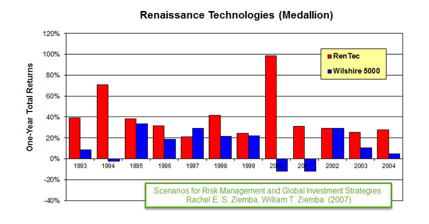
We’re also going to mine the list of holdings at Renaissance Technologies (RenTec) using a variety of resource including www.insidermonkey.com. Why monitor the exploits of Jim Simons and his team??? (1) Check out this TED Talk: The Mathematician Who Cracked The Wall Street Code and (2) this excerpt of the hedge fund’s track record …

MANIFEST 40 Updates

  • 8. General Electric (GE)
  • 24. Danaher (DHI)

Round Table Stocks: ABB (ABB), MSC Industrial (MSM), Stifel Financial (SF)

Results, Remarks & References

Companies of Interest: Value Line (7/15/2016)

The average Value Line low total return forecast for the companies in this week’s update batch is 4.9% vs. 6.0% for the Value Line 1700 ($VLE).

Materially Stronger: AAON (AAON)

Materially Weaker: Stonemor (STON)

Discontinued: Constant Contact (CTCT)

Coverage Initiated/Restored: LGI Homes (LGIH), United-Guardian (UG), Nature’s Sunshine (NATR), WCI Communities (WCIC), Clearwater Paper (CLW), Huttig Building (HBP), Mastech (MHH), Citizen’s Holding (CIZN), United Bankshares (UBOH), Citizen’s Financial (CFG), Liberty Interactive (QVCA)

Market Barometers

Value Line Low Total Return (VLLTR) Forecast. The long-term low total return forecast for the 1700 companies featured in the Value Line Investment Survey is 6.0%, down from 6.1% last week. For context, this indicator has ranged from low single digits (when stocks are generally overvalued) to approximately 20% when stocks are in the teeth of bear markets like 2008-2009.

Stocks to Study (7/15/2016)

  • Akamai Technologies (AKAM) — Highest MANIFEST Rank
  • Investment Technology (ITG) — Highest Low Return Forecast (VL)
  • Stifel Financial (SF) — Lowest P/FV (Morningstar)
  • Morgan Stanley (MS) —Lowest P/FV (S&P)
  • LSB Industries (LXU) — Best 1-Yr Outlook (ACE)
  • Charles Schwab (SCHW) — Best 1-Yr Outlook (S&P)
  • Stifel Financial (SF) — Best 1-Yr Outlook (GS)

The Long & Short of This Week’s Update Batch

The Long & Short. (July 15, 2016) Projected Annual Return (PAR): Long term return forecast based on fundamental analysis and five year time horizon. Quality Ranking: Percentile ranking of composite that includes financial strength, earnings stability and relative growth & profitability. VL Low Total Return (VLLTR): Low total return forecast based on 3-5 year price targets via Value Line Investment Survey. Morningstar P/FV: Ratio of current price to fundamentally-based fair value via www.morningstar.com S&P P/FV: Current price-to-fair value ratio via Standard & Poor’s. 1-Year ACE Outlook: Total return forecast based on analyst consensus estimates for 1-year target price combined with current yield. The data is ranked (descending order) based on this criterion. 1-Year S&P Outlook: 1-year total return forecast based on S&P 1-year price target. 1-Yr “GS” Outlook: 1-year total return forecast based on most recent price target issued by Goldman Sachs.

Discovery Club

From the article, “How To Beat The Market By 20 Percentage Points”, the author suggested:

“Dump your hedge funds and imitate their small-cap stock picks.”

Small cap is not necessarily small (faster-growing) companies but in general, we like the idea of a nice blend. So yes, we’re interested in hunting down some actionable ideas among the most successful investors on our radar screen — seeking companies that aren’t on too many radar screens, yet.

The discovery of smaller, promising and faster-growing companies has always been one of our favorite (and rewarding) activities. In that spirit, we’re expanding our efforts in this realm. This week, we redouble our efforts to discover some smaller, less discovered companies and add them to our coverage. The EXTENDED EDITION of the Value Line Investment Survey will be the first resource scanned and we’ll also take a look at some new positions or significant accumulations among our Best Small Company Funds starting with Brown Small Company.

But it doesn’t end with only the smaller companies, we’ll also be vigilant for opportunities flagged by reviewing the quarterly filings of idea generation resources like the Renaissance Technologies hedge fund.

Coverage Initiated/Restored: LGI Homes (LGIH), United-Guardian (UG), Nature’s Sunshine (NATR), WCI Communities (WCIC), Clearwater Paper (CLW), Huttig Building (HBP), Mastech (MHH), Citizen’s Holding (CIZN), United Bankshares (UBOH), Citizen’s Financial (CFG)

https://www.manifestinvesting.com/dashboards/public/discovery-club-20160715

Danaher (DHR): Look Out Below?

Danaher (DHR) nudged up to a relative strength of 70+ but has subsided back to 66.7.

The following analyses suggest a higher potential/probability of some short- and intermediate-term price disturbance … but depending on portfolio-centered decisions, likely a hold in most portfolios.

But a stock price speed bump wouldn’t surprise us.

Dhr 10yr 20130410

Danaher (DHR) is a consensus hold based on the following perspectives:

Dhr pov 20130410

Business Model Analysis

It’s pretty clear why Danaher (DHR) has been a long-time community favorite and charter member (since 9/30/2005) of the MANIFEST 40.

Say it with me: “Up, Straight and Parallel”

The analysis supports a sales growth forecast of 7-10%, consistent with the opinions of Value Line, Morningstar and S&P.

Dhr model 20130410

Chronicle: Return Forecast and Quality EKG

Dhr chronicle 20130410

Look Out Below: RSI Breaks

Hypnotized
Photo Credit: anguila40 via Compfight cc

Hypnotized?

Momentum is powerful and addictive.  It can be hard to perform a selling analysis on a company that has been so good to you and your portfolio that you’re considering naming your next child or grandchild after the company.  We’ve often wondered if we could build a monitoring method that could use relative strength indices and overbought breakdowns as another component of our portfolio-centered approach that is based on return forecasts and quality rankings.

We continue our exploration and vigilance using these long-term charts, starting with the company with the highest RSI at this time, Pfizer (PFE). The case studies will also include McDonald’s (MCD), Stryker (SYK) and Apple (AAPL).

We’ll close with an answer to the question: “It’s down 36% from its highs, would you buy Apple right now?”

Pfizer (PFE) has delivered a fairly massive advance — during a period when it went “non-core” with low and uncertain growth expectations over the last several years. The stock price has basically tripled in four years.

We’re reminded that a company can maintain an overbought condition (RSI>70) for months and even years … but we’ll be monitoring PFE going forward for the day when an excursion takes it to a value less than 70.

Just for kicks, a side-by-side comparison of the chronicle for Pfizer (PFE) displaying the elevated return forecasts at the price bottom, the convergence point (mid-2010) shown in the preceding image … and a steadily improving quality ranking.

Roll Call

So … are any of the stocks in neighborhood of 70 displaying “breaks” below 70 — making them sell consideration candidates?

We’ll start with the companies with return forecasts (PAR) less than the market median (MIPAR) at this time. We see that five companies cry out for a closer look. And since these would be more “challengeable” in portfolios (more likely to reside among the lower PARs in portfolios), it’s probably prudent and timely to do this on a continuing basis going forward.

The long-term RSI for 3M Company (MMM) is still increasing. We’ll be watching.

McDonald’s (MCD) is interesting. I hope none of you mind while I “think out loud” while trying to learn and decide with respect to the long-term potential value of monitoring from this perspective.

Observations:

1. I’ve shown three of the RSI breaks since 2008, denoted with the red arrows.

2. The concept is that we’re not surprised to see either a stock price decline or a disruption accompanied by an “extended trading range” following one of these turbulent disruptions.

3. The magnitude of the stock price correction and/or duration of the trading range seems to be somewhat proportional to the amount of geometric area (shaded green) preceding the price break. Note the subdued disruption in late 2010/early 2011.

4. We also know that we can be less concerned with high-quality core stocks and that RSI dips are less destructive so long as the long-term (60-month) trend, denoted in blue here is strong and increasing from left-to-right. (This is very consistent with our core holding and quality emphasis “theology.”)

5. I need to do more research regarding the RSI=50 level/threshold. Are the “reflections” or bounces at RSI=50 typical? Is there a chance that these reflections are signals (see mid-2009 and 4Q2012 & subsequent price advance) that the extended trading range could be waning or ending?

I hope the Danaher (DHR) 10-year chart will help illustrate why we’re scratching our heads over this. The magnitude and duration of the price corrections following the RSI breaks on this chart seem to be quite “proportional” to the overbought areas.

Community favorite Fastenal (FAST). It’d probably be fascinating to take a look at community sentiment (particularly the hand-wringing variety) during the relatively few disruptions over the last ten years. Note that FAST navigated/mitigated the bear market period exceptionally well during 2008-2009.

More research nudged on the RSI=50 breach moment shown here …

Leave it to community favorite Stryker (SYK) to be among the most colorful of this stroll.

1. The RSI, although near 70, is still an increasing trend.

2. Stryker (SYK) spent an extended period at the top of the MANIFEST 40, fueled by accumulation trends following that price correction in the middle of this display.

Shine Off The Apple?

And we’ll wrap up for now with the $64,000 question and one that many of you are waiting for: What does Apple (AAPL) look like?

Observations:

1. Apple is the most widely-followed stock in the MANIFEST 40.

2. The strength of that long-term (5-year trailing average) is massive.

3. That leads to a situation where AAPL was “potentially overbought” for a significantly extended period. See the RSI area from early 2010 to late 2012 — a period of over two years. This serves as a powerful reminder that under the right conditions, a stock can be overbought for a long time.

4. The area of the disruptions (stock price decline in combination with the duration of the trading range) does seem to correlate with the RSI areas and sharpness (rate of decline) of the overbought RSI condition.

During the most recent Round Table I was asked if I would sell (or buy) Apple as a long-term investor.

My short answer was that I didn’t think it was time to buy (yet).

We also want to point out that we strongly urged a trailing-stop mentality (if not programmed stops) for Apple in a series of articles a little over a year ago. Those of you who heeded that suggestion, you’re welcome.

This series of charts provides my longer answer to the question posed by the webcast attendee.

Take a look at the current area of disruption on display here for AAPL. Compare the preceding overbought RSI area, rate of RSI decline, etc. for the previous corrections. The extended period where RSI>70 leads to a pretty good size green-shaded area with an amplitude similar to previous episodes.

I think the yellow-shaded area is going to get materially larger for AAPL as this chart rolls forward. The only way for that to happen is for either (1) a continued price drop or (2) an extended trading range … or (gulp) a combination of both.

We’ll certainly be watching for a gain back above RSI=50 that is sustained. But I think it’s far more likely that the stock price for AAPL could continue to decline to the point where RSI is less than 30. I’d be vigilant for price surges to the upside to reduce my position over time — all the while waiting for the reversals that will put an end to the disruption area shown here.

We’ll continue with more long-term RSI snapshots in the Manifest Investing forum and will certainly flag any that deserve to be “flagged” and hope that any ensuing hypnosis will lead to focused vigilance … and an incremental benefit to our long-term returns.