This started with the top trailing 10-year performers from the S&P 500, which is cool — and at least they got that going for them. But we know the virtues of All-of-the-Above investing, which means the Value Line 1700 list is even cooler. Look what Groundhog Nation did with them.
Carl Quintanilla (CNBC) provided this list of the best performing stocks in the S&P 500 since the market low ten years ago.
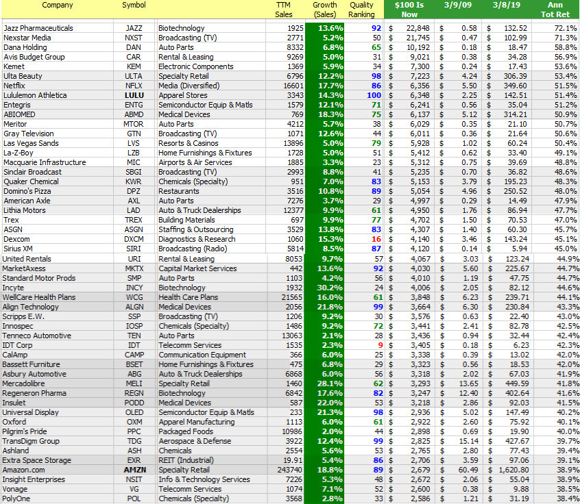
It’s been fun and rewarding for many. Take note how many of these have been covered and/or resident in our model portfolios, etc. since then.
Who did we miss? Why?


So what were you doing when the “Great” Recession bottomed on March 9, 2009? CNBC got this whole this started with the S&P 500 but we know that even better opportunity manifests in the Value Line 1700 — and we weren’t disappointed.
There are 1200 stocks with stock price data for 3/9/2009 and 3/8/2019, ten years later. Investing $100 into each of these 1200 ($120,000) would worth $1,012,892 this past weekend — an annualized total return of 23.8%. Sorry, Carl Quintanilla, but the S&P 500 checks in at 17.3%.
- The annualized total return (10 years) on the Wilshire 5000 (VTSMX) is 17.5%. 655 of the 1200 stocks (54.6%) beat the market. This collective of gainers have an average quality ranking of 69.
- 1138-of-1200 (94.8%) gained and a have a current value greater than $100. The stocks that lost ground have an average quality ranking of 27.
- The top performing decile has a sales growth forecast of 9.2%. The bottom decile stands with a 5.3% growth forecast.
- If the Value Line Arithmetic Average were “investable,” the annualized total return was 19.7% as 999.30 advanced to 6046.07 during the time period. All-of-the-Above Investing works.

Gone Hog Wild (March 2009)
Every year we run a stock picking contest that starts on Groundhog Day and continues until the next Groundhog Day. Back in March 2009, we featured the most-frequently selected stocks as something of a screening exercise. As the accompanying image shows, yes, Virginia, the average return forecast was “north” of 20% at the time.
The Sweet 16 stocks featured back in March 2009 generated a return of 21.2%.
The top performer was the swing-for-the-fences selection of Sigma Designs (SIGM) and every once in a while, Casey does not always strike out. 36.6% can be a wonderful thing. But the rest of the field was also formidable and include a number of community favorites (Manifest Investing 40 residents).


Sweet 16 (3/1/2009) Results — Ten Years Later. As shown the collective performance of the (16) selections known as “Heavy Hogs” delivered a 21.2% annualized total return. Dividends are included. We can’t help but note the strong performance from the companies at the top of the 10-year-old screening results vs. the achievements of some nearer the bottom. Quality Systems (QSII) morphed into NextGen Healthcare (NXGN). [Editor’s Note: If we’d only listened to Cy Lynch and WellCare Health Plans (WCG) at the time, +44.1%.] Buffalo Wild Wings (BWLD) was acquired by Arby’s after a considerable gain. Navellier Fundamental (NFMAX) evolved into a private wrap offering, results shown are from Navellier fact sheet (https://navellier.com/files/3815/4964/8534/fundamental-a-factsheet.pdf).
Invest With Your Friends. The journey can be a most informative, rewarding and entertaining adventure.
Start a test drive (trial subscription) at http://www.manifestinvesting.com ($79/year, group discounts for club partners and educators) and participate in the next ten years of going “Hog Wild.”
Questions?
Contact Mark Robertson via markr@manifestinvesting.com or via Twitter by reaching out to @manifestinvest. Manifest Investing also maintains a “slipstream blog” at Facebook: https://www.facebook.com/manifestinvesting/ Comments and inquiries welcome.