We’re often asked for opinions on Apple (AAPL) and our approach/outlook is unchanged … at least not much. We do note that AAPL flipped to a bullish point-and-figure condition with a slight boost in price objective. But we still see the stock as vulnerable to a continued price drop or extended trading range. I still love the answer that Jeff Gundlach gave during the Q&A following a recent webcast. His response to “Should I buy Apple?”: “That depends. Are you really, really, really a long-term investor? How will you react if the price drops from $425 to the low $300s? If your time horizon is relatively long and you’re comfortable with a price that plummets from time to time, I’d say it’d be OK to buy/accumulate AAPL.” We still think that trailing stop protection on stocks like AAPL is a really good idea.
Expectations at Hugh’s Staples (SPLS) did relax a little bit — but the long-term outlook (for patient investors) is still strong.
Recent Round Table selection Intel (INTC) is among the best-positioned companies in the Issue 7 update.
Momentum is powerful and addictive. It can be hard to perform a selling analysis on a company that has been so good to you and your portfolio that you’re considering naming your next child or grandchild after the company. We’ve often wondered if we could build a monitoring method that could use relative strength indices and overbought breakdowns as another component of our portfolio-centered approach that is based on return forecasts and quality rankings.
We continue our exploration and vigilance using these long-term charts, starting with the company with the highest RSI at this time, Pfizer (PFE). The case studies will also include McDonald’s (MCD), Stryker (SYK) and Apple (AAPL).
We’ll close with an answer to the question: “It’s down 36% from its highs, would you buy Apple right now?”
Pfizer (PFE) has delivered a fairly massive advance — during a period when it went “non-core” with low and uncertain growth expectations over the last several years. The stock price has basically tripled in four years.
We’re reminded that a company can maintain an overbought condition (RSI>70) for months and even years … but we’ll be monitoring PFE going forward for the day when an excursion takes it to a value less than 70.
Just for kicks, a side-by-side comparison of the chronicle for Pfizer (PFE) displaying the elevated return forecasts at the price bottom, the convergence point (mid-2010) shown in the preceding image … and a steadily improving quality ranking.
Roll Call
So … are any of the stocks in neighborhood of 70 displaying “breaks” below 70 — making them sell consideration candidates?
We’ll start with the companies with return forecasts (PAR) less than the market median (MIPAR) at this time. We see that five companies cry out for a closer look. And since these would be more “challengeable” in portfolios (more likely to reside among the lower PARs in portfolios), it’s probably prudent and timely to do this on a continuing basis going forward.
The long-term RSI for 3M Company (MMM) is still increasing. We’ll be watching.
McDonald’s (MCD) is interesting. I hope none of you mind while I “think out loud” while trying to learn and decide with respect to the long-term potential value of monitoring from this perspective.
Observations:
1. I’ve shown three of the RSI breaks since 2008, denoted with the red arrows.
2. The concept is that we’re not surprised to see either a stock price decline or a disruption accompanied by an “extended trading range” following one of these turbulent disruptions.
3. The magnitude of the stock price correction and/or duration of the trading range seems to be somewhat proportional to the amount of geometric area (shaded green) preceding the price break. Note the subdued disruption in late 2010/early 2011.
4. We also know that we can be less concerned with high-quality core stocks and that RSI dips are less destructive so long as the long-term (60-month) trend, denoted in blue here is strong and increasing from left-to-right. (This is very consistent with our core holding and quality emphasis “theology.”)
5. I need to do more research regarding the RSI=50 level/threshold. Are the “reflections” or bounces at RSI=50 typical? Is there a chance that these reflections are signals (see mid-2009 and 4Q2012 & subsequent price advance) that the extended trading range could be waning or ending?
I hope the Danaher (DHR) 10-year chart will help illustrate why we’re scratching our heads over this. The magnitude and duration of the price corrections following the RSI breaks on this chart seem to be quite “proportional” to the overbought areas.
Community favorite Fastenal (FAST). It’d probably be fascinating to take a look at community sentiment (particularly the hand-wringing variety) during the relatively few disruptions over the last ten years. Note that FAST navigated/mitigated the bear market period exceptionally well during 2008-2009.
More research nudged on the RSI=50 breach moment shown here …
Leave it to community favorite Stryker (SYK) to be among the most colorful of this stroll.
1. The RSI, although near 70, is still an increasing trend.
2. Stryker (SYK) spent an extended period at the top of the MANIFEST 40, fueled by accumulation trends following that price correction in the middle of this display.
Shine Off The Apple?
And we’ll wrap up for now with the $64,000 question and one that many of you are waiting for: What does Apple (AAPL) look like?
Observations:
1. Apple is the most widely-followed stock in the MANIFEST 40.
2. The strength of that long-term (5-year trailing average) is massive.
3. That leads to a situation where AAPL was “potentially overbought” for a significantly extended period. See the RSI area from early 2010 to late 2012 — a period of over two years. This serves as a powerful reminder that under the right conditions, a stock can be overbought for a long time.
4. The area of the disruptions (stock price decline in combination with the duration of the trading range) does seem to correlate with the RSI areas and sharpness (rate of decline) of the overbought RSI condition.
During the most recent Round Table I was asked if I would sell (or buy) Apple as a long-term investor.
My short answer was that I didn’t think it was time to buy (yet).
We also want to point out that we strongly urged a trailing-stop mentality (if not programmed stops) for Apple in a series of articles a little over a year ago. Those of you who heeded that suggestion, you’re welcome.
This series of charts provides my longer answer to the question posed by the webcast attendee.
Take a look at the current area of disruption on display here for AAPL. Compare the preceding overbought RSI area, rate of RSI decline, etc. for the previous corrections. The extended period where RSI>70 leads to a pretty good size green-shaded area with an amplitude similar to previous episodes.
I think the yellow-shaded area is going to get materially larger for AAPL as this chart rolls forward. The only way for that to happen is for either (1) a continued price drop or (2) an extended trading range … or (gulp) a combination of both.
We’ll certainly be watching for a gain back above RSI=50 that is sustained. But I think it’s far more likely that the stock price for AAPL could continue to decline to the point where RSI is less than 30. I’d be vigilant for price surges to the upside to reduce my position over time — all the while waiting for the reversals that will put an end to the disruption area shown here.
We’ll continue with more long-term RSI snapshots in the Manifest Investing forum and will certainly flag any that deserve to be “flagged” and hope that any ensuing hypnosis will lead to focused vigilance … and an incremental benefit to our long-term returns.
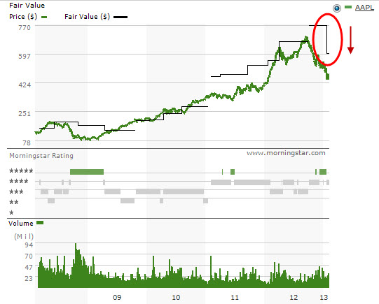
FYI … both Morningstar (from $770 to $600) and S&P have reduced their fair value estimates on Apple (AAPL) in recent days. Analyst consensus estimates for sales and EPS for years ending 9/30/2013 and 9/30/2014 also reduced. The impact on our return forecast will take it from 24% to 18-19% — still undervalued, just not as much. Point-and-figure (PnF) sentiment on www.stockcharts.com has turned “Prelim Bullish”.
A year ago, we urged investment conference audiences to always remember that “Speed Bumps Happen.” We also joined with Joshua “Reformed Broker” Brown to compare the price target gold rush for Apple to what we saw from the late 1990s and companies like Qualcomm.
Is 2012 Apple The New 1999 Qualcomm? (From April 3, 2012)
This week, we take a look at 1999 Qualcomm vs. 2012 Apple. My investment club was an active participant in QCOM 1999, something that Ken Janke called “the WILDEST RIDE he’d ever experienced in nearly 50 years of long-term investing.” What can we learn from history?
During a recent webcast, Barry Ritholtz of The Big Picture raised the question as to whether business and stock price conditions at Apple could be similar to Qualcomm a little over a decade ago. (www.ritholtz.com/blog is a TROVE of investment information.)
At the recent Mid-Michigan regional investing conference, we reviewed portfolios that were dripping Apple juice. It’s a good problem to have. Should we sell?
I urged attendees, particularly Apple loyalists to carefully ponder a couple of realities: (1) Apple has historically been VERY successful at protecting market share. Rabid advocates take customer loyalty to a whole new level.
(2) Apple has historically been weak at capturing incremental market share beyond the rabid faithful.
(3) Treat any analysis of Apple in much the same way that we regard Pfizer/Pharmacia/etc. and other bolt-on acquisitions. Even though the Apple new markets/divisions come from within, they behave with the characteristics of bolt-on acquisitions ultimately … a form of hybrid M&A. Be careful with those 60-80% quarterly year-over-year results.
There are certainly similarities when it comes to price behavior. Note that the relative strength index (RSI) trends are quite similar, indeed. So from a technical analysis perspective, it naturally begs the question about speed bump vulnerability.
But the price history provides a little different perspective. Although the incredible stock price surge in Apple (AAPL) is formidable, it actually pales versus the advance in Qualcomm during calendar 1999.
We also note that the Value Line low total return forecast for Qualcomm back then went seriously negative — a sign that the rhinos were pretty confused about business prospects (growth and profitability) in the wake of shedding handset manufacturing to focus on the achievable royalties from an emphasis on innovation.
The side-by-side business model analysis displays some similarities.
The biggest question revolves around achievable profit margins for Apple going forward depending on the product mix. For 1999 Qualcomm, the convergence of the bottom line (EPS) with the top line (Sales) suggested a significant shift in net margin (%) and was at the heart of the confusion at the time.
One of my most powerful memories of Y2K are the rapidly evolving forecasts as it seemed every analyst on Wall Street engaged in a game of one-up the other guy. The rhinos elbowed their way to higher fundamental expectations in a wake of “P/E ratios no longer matter any more.” “You’re such a dinosaur.” “Earnings? We don’t need no stinking earnings!”
We note the step changes in the fair value estimate from Morningstar here … and note that S&P has ratcheted from a fair value estimate of $426.70 (fairly recently) to a new plateau of $752.80!
Apple isn’t finished, yet. Whether reinventing the music business, making phones smarter, offices more portable, making meaningful Mandarin in-roads or redefining television. By the way, I find that I watch more TV on my laptop than in the living room these days — that’s clearly intriguing. At least as compelling as the day ten years ago when I realized I listened to, and bought, more music via my computer despite some crummy speakers. Remember Napster: The Original? Steve Jobs noticed and capitalized.
For all we know, Apple is working on a transporter beam … and the project is in “alpha.” 🙂
As shown here, the transformation of 1999 Qualcomm was at the heart of the mystery. Few of us saw the margin enhancement, maturation and persistence for Qualcomm at the time. In the case of present day Apple, having a vision for what is possible when it comes to profitability is at the core. (Sorry … couldn’t resist, pun intended.)
Is 2012 AAPL The New 1999 QCOM?
No. Yes. From a price momentum perspective, somewhat.
The business model transformation at 1999 QCOM was massive. The 2012 AAPL version is a little more subdued but nonetheless temporarily confusing to the rhinos. The talking head appearances are definitely approaching full deja vu status with $1000 and $1001 price targets for Apple as recently as yesterday.
Should we sell? Could Apple be a roman candle? We’d recommend consideration of trailing stops – particularly for any positions (or portions) that exceed concentration guidelines.
As the haircuts in the accompanying figure provide a reminder, speed bumps are inevitable.


")